Challenge
Redfin’s customer-facing templates were out of date and inconsistent.
Goals
• Design a style guide to mirror the latest web UI kit
• Build a code sandbox for the email marketing team.
Deliverables
• Sketch mockups & HTML code
• I set up a handoff system so the email marketing team could sync with the latest updates.
Before any actual designing, I had 3 objectives in mind. The templates would have to be:
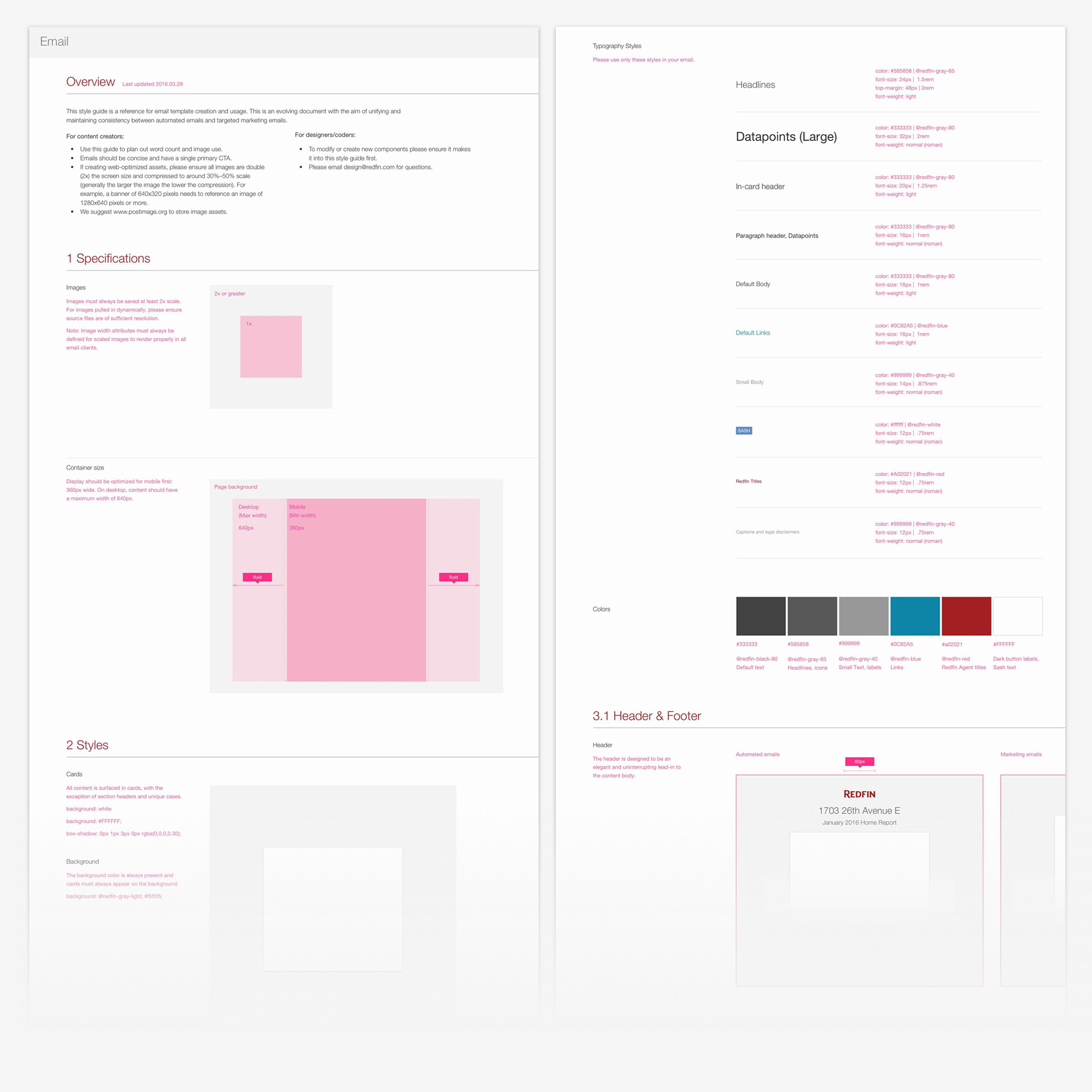
1) Simple: Completely fluid, mobile-optimized layout without using media queries
2) High quality: Full retina-display support (no blurry images)
3) Consistent: Parity with web UI kit
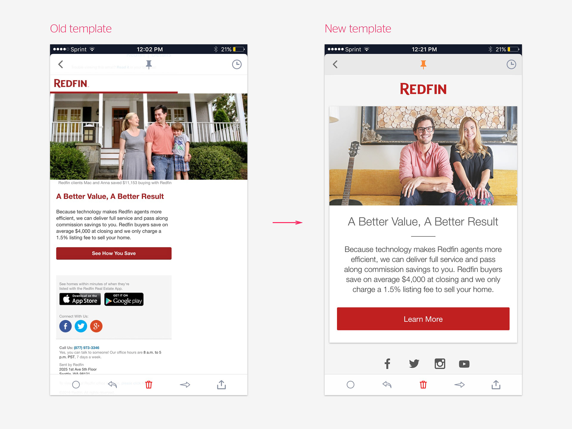
I developed a unique method involving attributes, inline css, and conditional comments that enables fluid retina images to display correctly on older Outlook clients, without media queries. All previous documented techniques require either fixed image size attributes or limiting resolution to 1x, neither of which were acceptable.
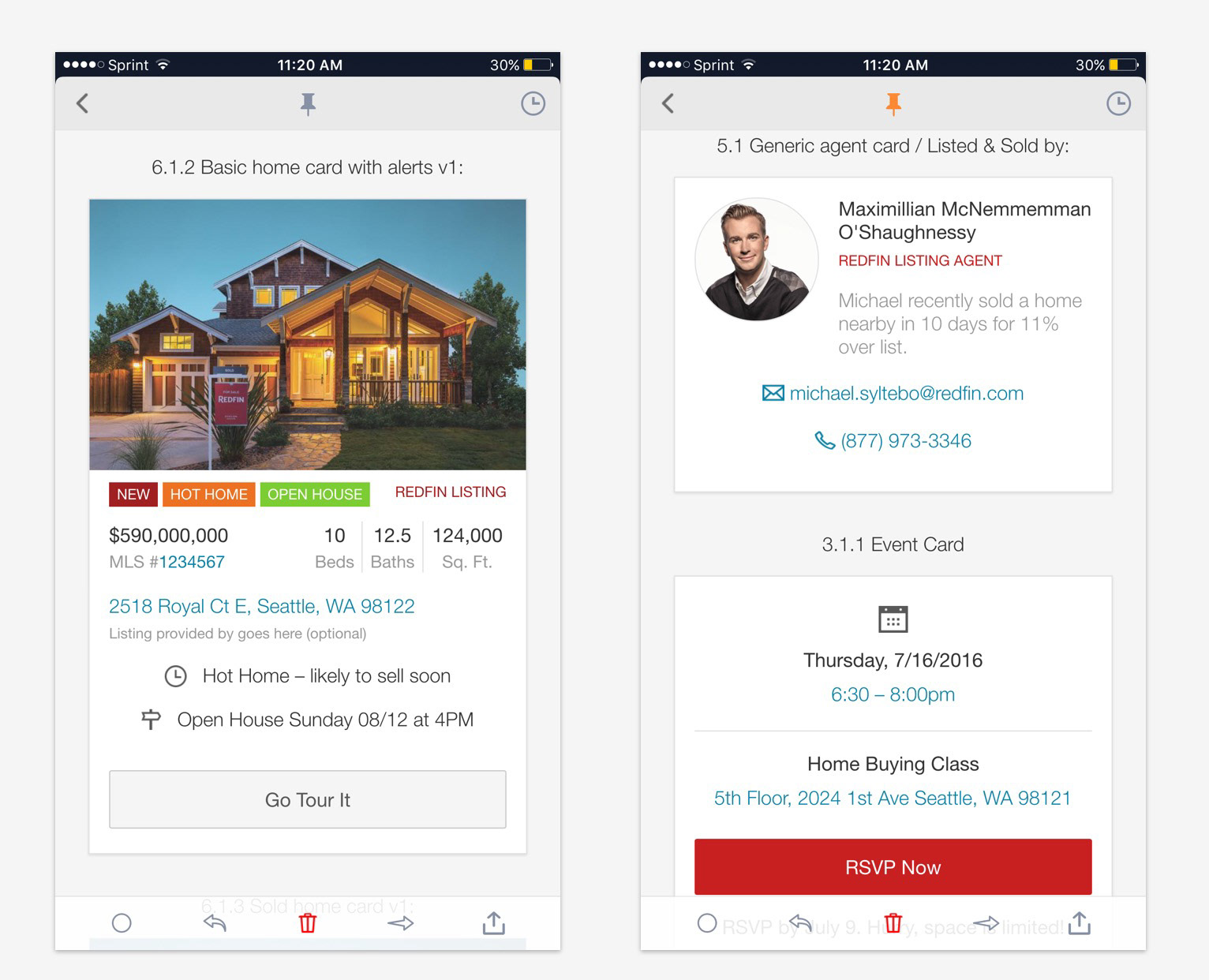
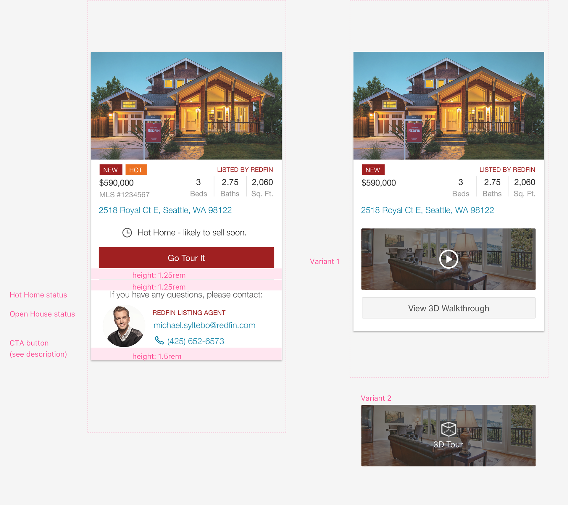
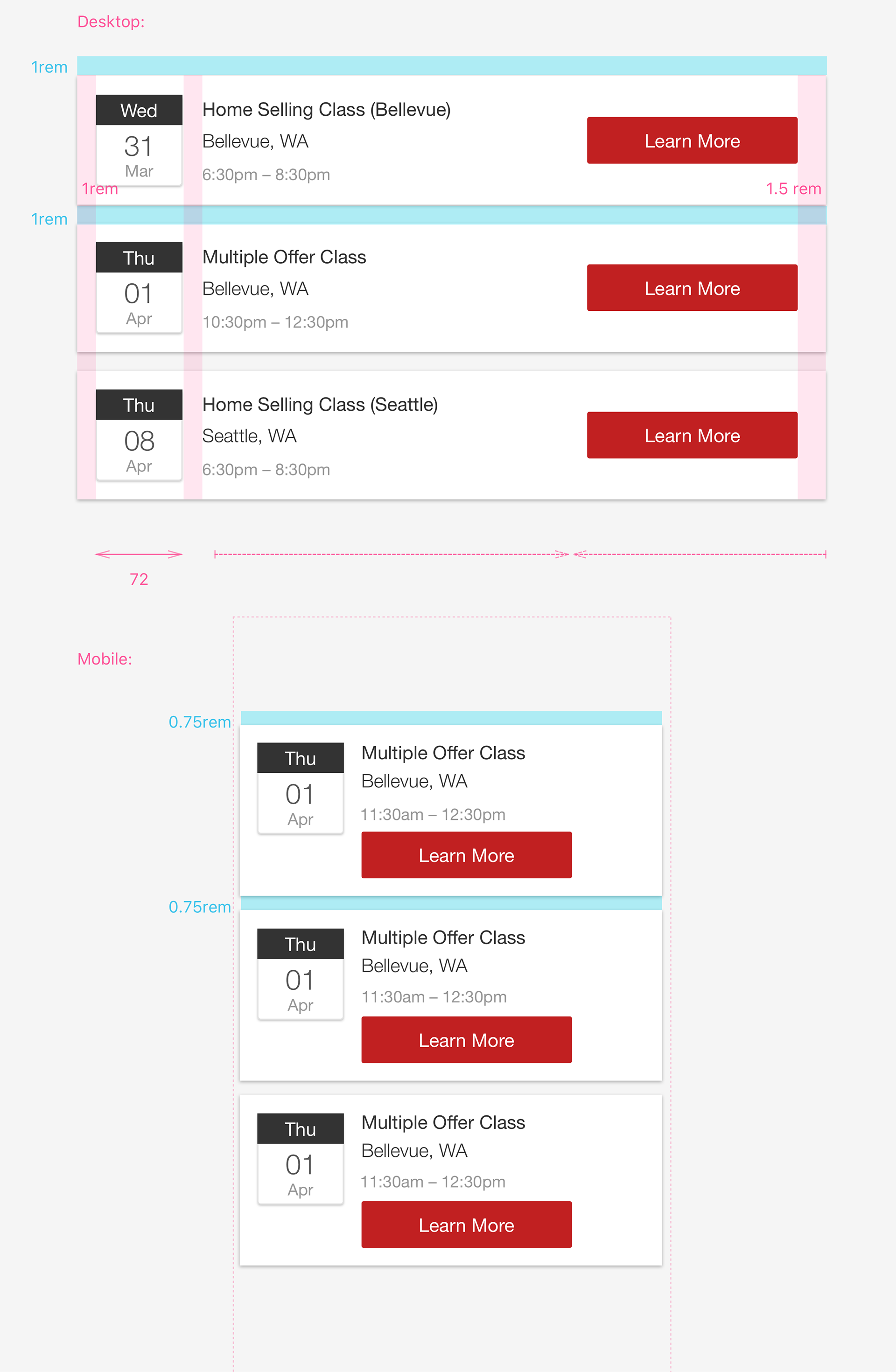
Without a dedicated ‘email designer’ role the templates needed to be modular, in which the content creator would be able to ‘drag and drop’ desired components to create new emails. Components containing dynamic data would be converted into content blocks by the email targeting software (Strongview) and simply called in to a new template.
Although non-inline styles were employed for mobile button enhancement, the templates were designed to look great without them.
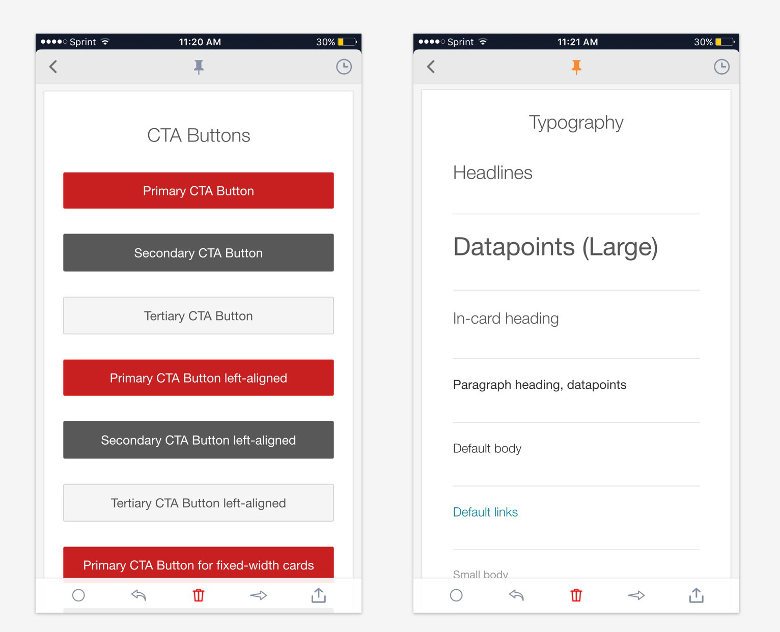
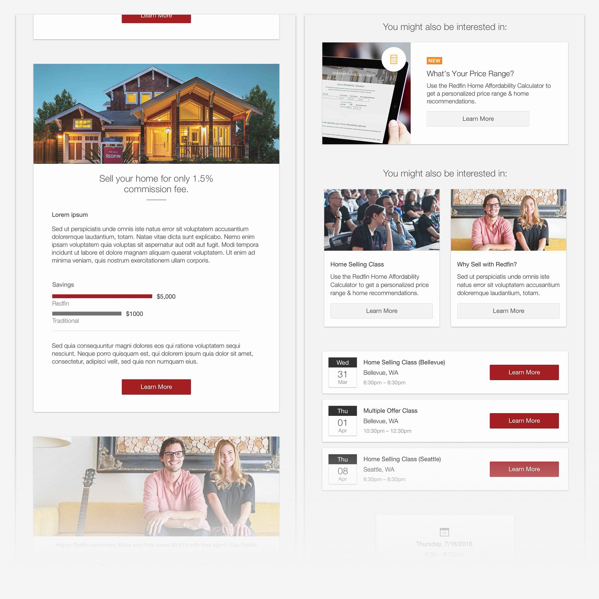
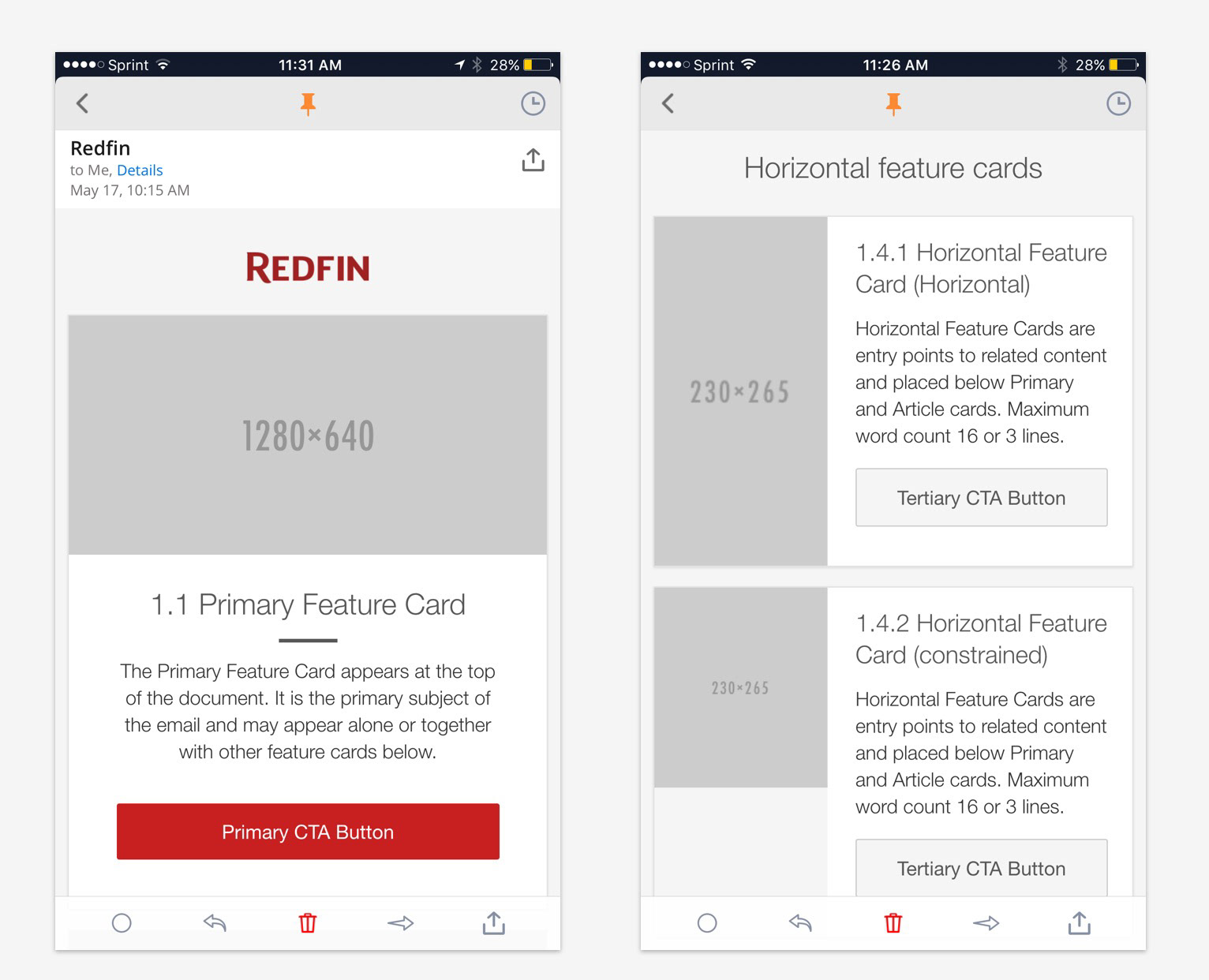
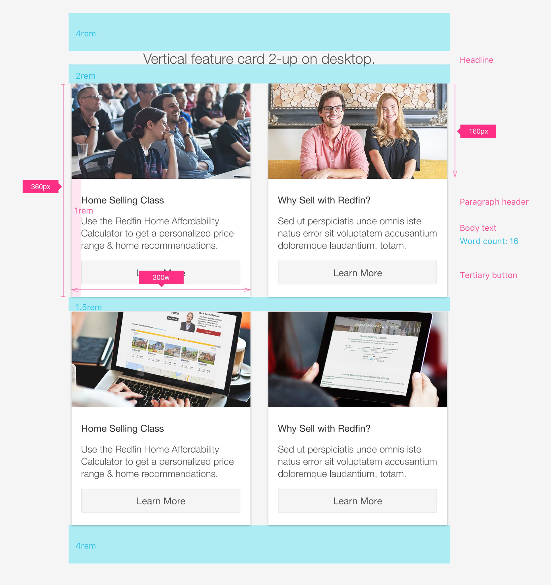
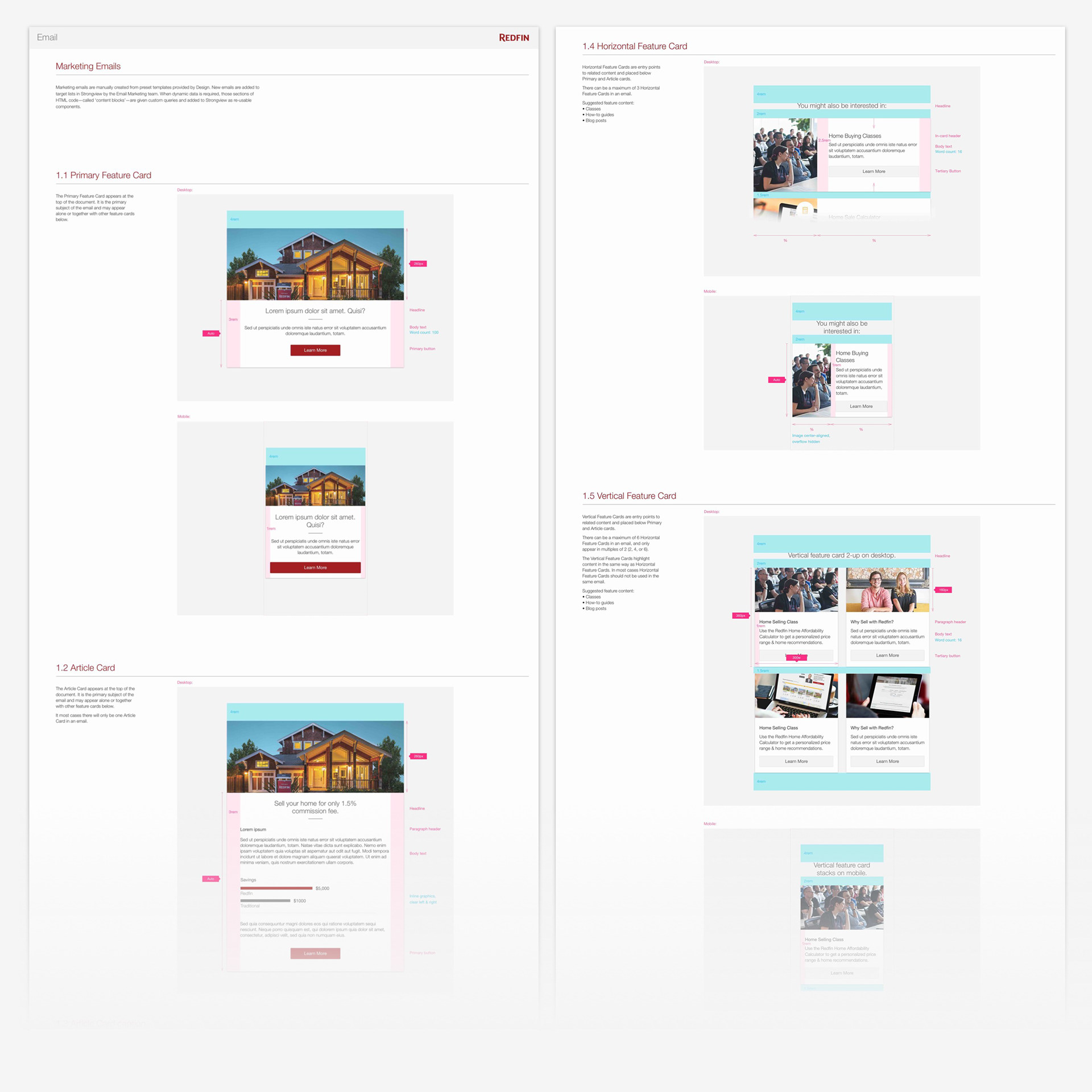
Sample pages from the Email Style Guide with guidelines:
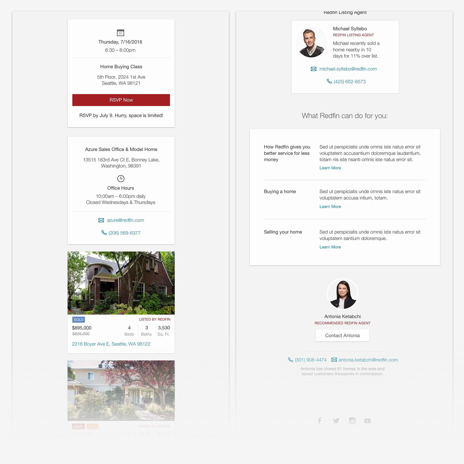

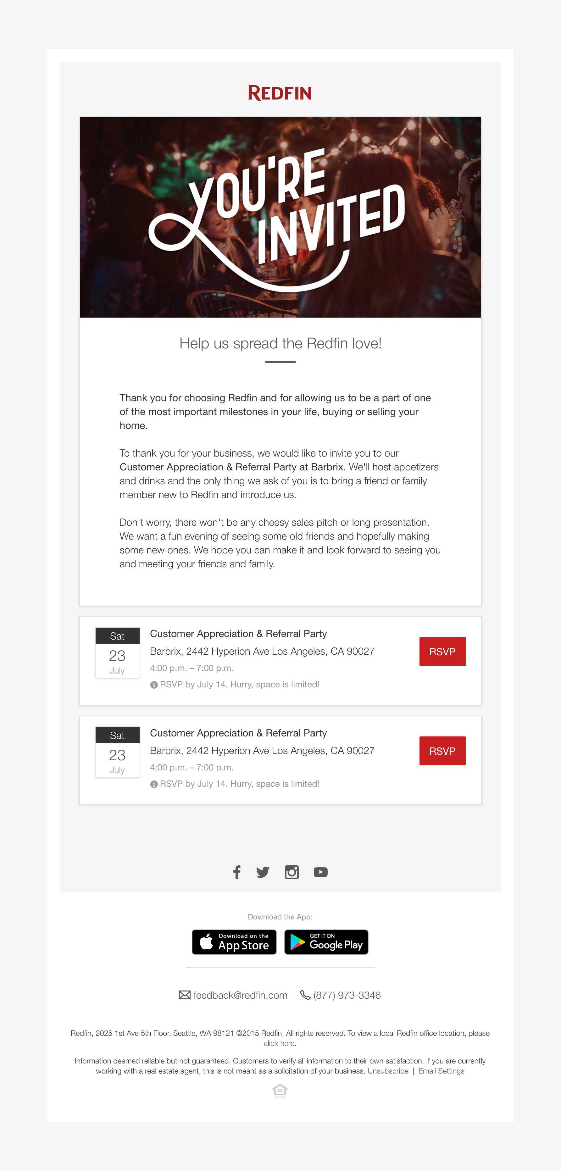
An example of the template used in an Events invitation email: