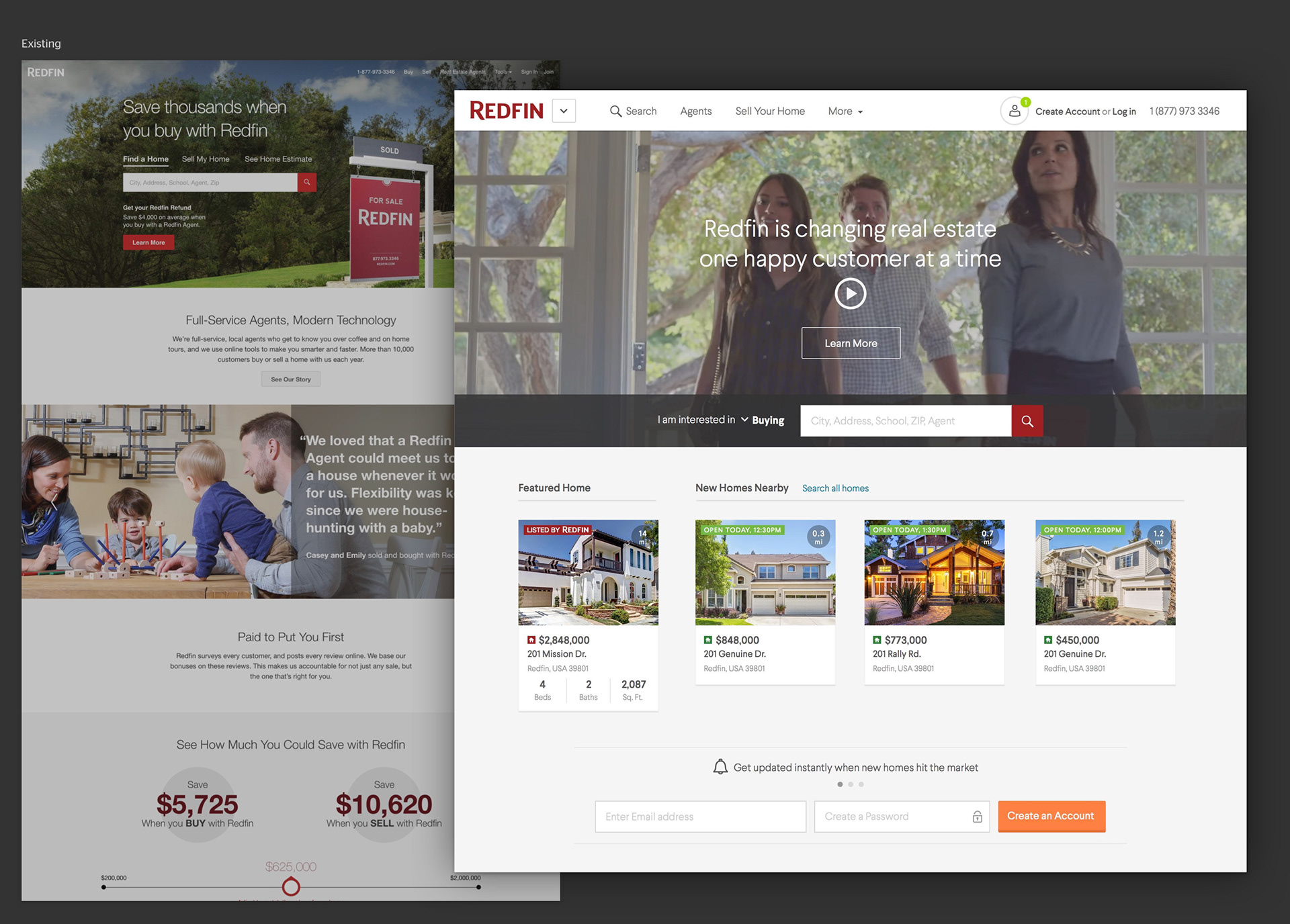
Challenge
• The Redfin homepage was owned by various stakeholders with different goals, resulting in a poor user experience.
• Redfin's key selling points were poorly communicated.
We were all aware that a full redesign was unrealistic, so the visual design team did a high level exercise to imagine how we could better communicate our message free of constraints.
Goals
• Better discoverability
• Leveraging data
• Less visual distractions
• Improve perception of quality
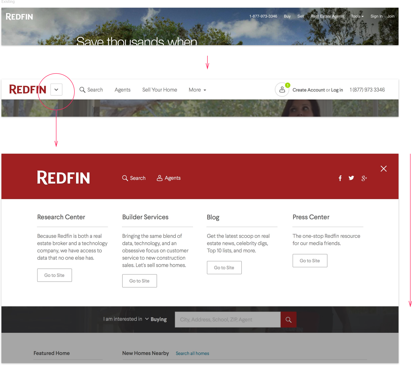
Global nav
Challenge
Non-consumer parts of the Redfin website were very hard to find. Examples include market research, press kits, and new construction partnerships. The 'Tools' dropdown and footer were the de facto place to dump pages that did't fit anywhere else.
Solution
I explored a global nav that would make non-consumer content easily accessible and communicate more of the Redfin business.
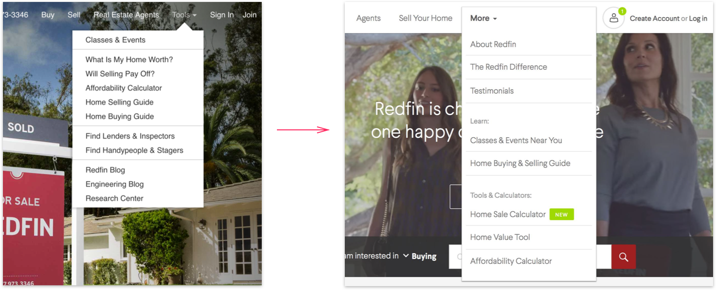
Dropdown menu
Challenge
The nav links are a link dump with no desired outcome.
Solution
Choice & discoverability. Sections are more clearly labeled and categorized.
Search bar
Challenge
The search bar is surrounded by visual distraction.
Solution
Relevant tabs were merged into a dropdown menu with an action-oriented label that invites the user to interact.

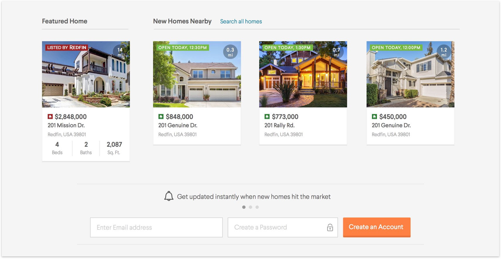
Using relevant data
Challenge
Beyond the search box, we didn't leverage any of our data to lead users down the home search funnel.
Solution
We would pull in nearby listings and reserve a space to market Redfin's own listings.
• A featured Redfin Listing also communicates the little-known fact that yes, Redfin has listings.
• An simple form with benefits-driven CTA messaging is an easy and valuable user entry point.
Key differentiators
Challenge
Many people don't know Redfin has salaried agents. Many don't know they can save more money, and those that do are skeptical that it affects quality of service (which it doesn't).
Solution
Communicate these 3 pillars in a very clear way, with benefits-driven copy.

Tools & learning
Challenge
Calculators and educational resources aren't useful when they are hidden away in the 'Tools' menu.
Solution
Help users in the pre-home buying & selling stage of the funnel to useful resources.

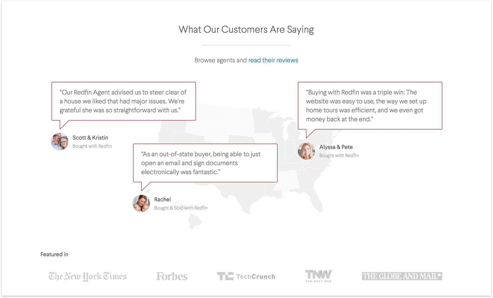
Trust
Challenge
Redfin's customer photography and uncredited quotes don't look genuine.
Solution
Show transparency; use avatars and link to actual reviews.
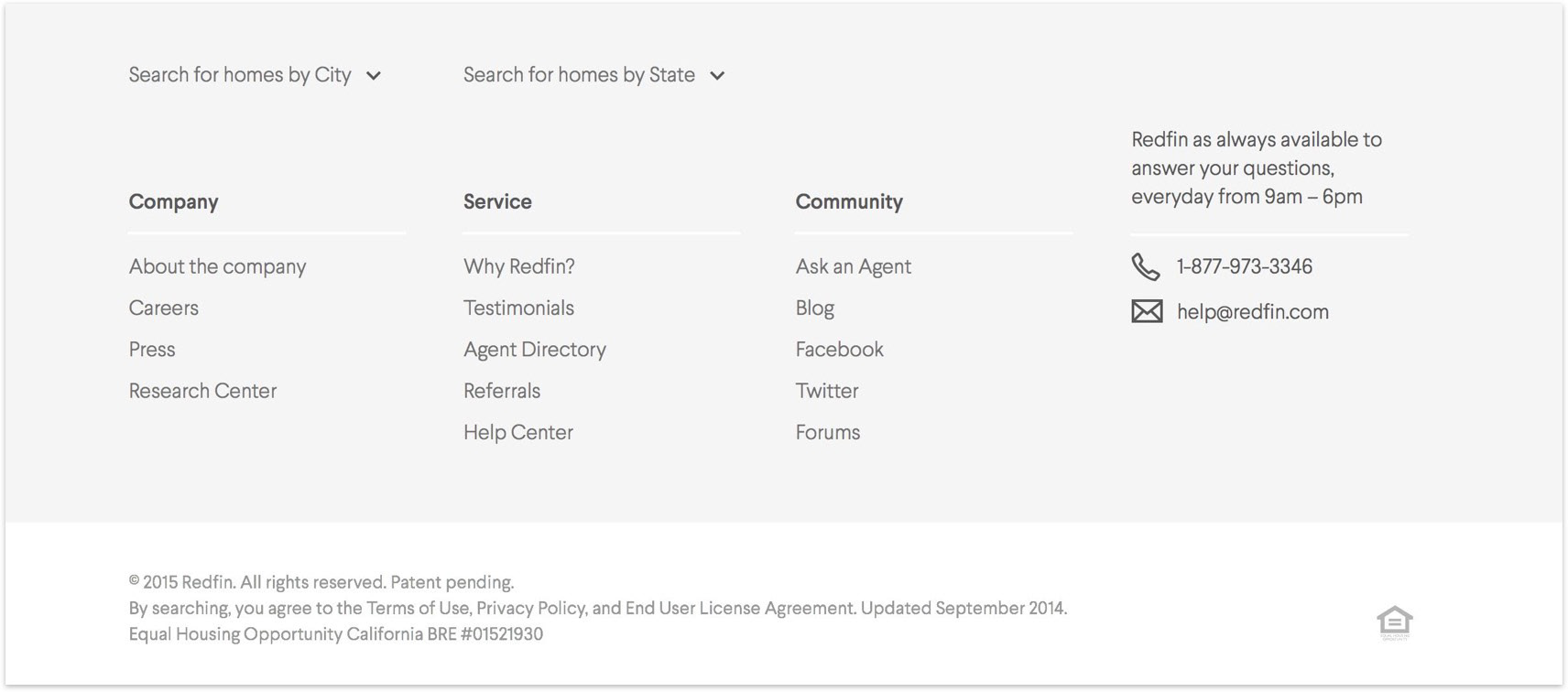
Cleaner footer
Challenge
The footer was huge and purely SEO-centric, not user-centric.
Solution
SEO text collapsed by default, and links clearly categorized.